What Fashion and Mobile Game Design Have in Common
Fashion and mobile game design may be very different creative disciplines, but they both rely on the same fundamental challenge. They have to communicate their identity rapidly. Before looking at the label, a jacket may be identifiable by shape, fabric, color, or pattern. The icon, typography, interface, characters, and visual theme are also applicable to a mobile game. In both instances, style conveys to the user an idea of what kind of experience they are viewing prior to engaging with it in detail.
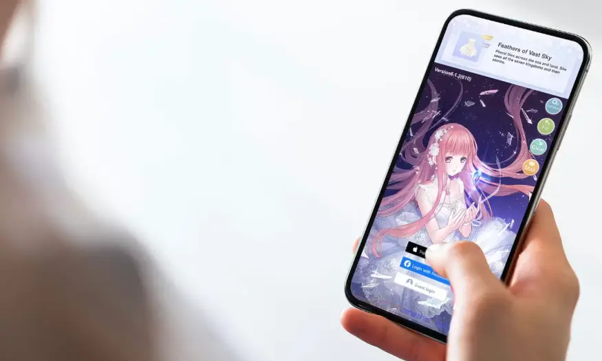
This becomes especially noticeable with mobile entertainment, where products often appear as small icons among many other apps. A person coming across a desi win apk or another game application may see the icon, screenshots, and color palette before opening the product itself. Those first visual signals can create familiarity and make the game easier to recognize later. Fashion uses the same principle when a recognizable combination of shapes and details gives a collection its own identity.
Both Start With a Recognizable Visual Identity
Building a strong visual identity isn’t about a single memorable image, it’s about the elements that combine to create it. Fashion designers link together silhouettes, fabrics, colours, patterns and repeated details to create a cohesive collection. Typography, shapes of the interface, character styles, illustration styles, background, and colors serve a similar function for mobile game designers. The parts can be different but they must appear to be part of the same system.
Recognition builds up through consistency. New screens, seasonal graphics or modes may be added to a game, but the same fonts, buttons shapes and colors can be employed. Materials and pieces can be changed within a fashion collection, or new pieces added, and the fashion still remains recognisable in terms of its proportions or motifs. The aim in both of the fields is to achieve enough variation to remain visually stimulating while maintaining recognisable characteristics of the product.
The App Icon Works Like a First Look
An app icon has to carry a lot of visual responsibility inside a very small square. It appears on a phone screen, in search results, inside a store listing, and sometimes next to notifications. That makes it similar to a detail in an outfit that immediately sets the tone. The icon cannot explain the full experience, but it can suggest its character through color, shape, and imagery.
Certain visual choices help an icon remain recognizable:
- A limited and consistent color palette.
- One clear central image or symbol.
- Shapes that remain readable at a small size.
- Typography that does not depend on tiny details.
- Visual elements that also appear inside the game.
When the icon and interface share the same design language, the transition from home screen to game screen feels connected. The user sees one identity rather than two unrelated visual styles.
Trends Change but the Core Style Stays Familiar
Trends continually change with respect to colors, fabrics, lines and cultural influences. Mobile games also change their look over time with new illustrations, interface treatments, event themes and visual effects. Change is an effective way to keep the presentation current but too much change all at once can make a familiar product less familiar.
A game might add a new background, different art or seasonal elements without altering the basic navigation and proportions of the game. When a familiar garment shape is combined with a new material or color, a similar effect occurs with fashion. This new version is fresh in that some changes have been made to it, but the identity remains the same, which people can hold on to.
Small Changes Can Refresh the Whole Look
It’s not always necessary to redesign for a visual update. Changing the accent color, modifying the type, updating icons, or changing the details of an illustration may change the tone of a mobile interface but not its usage patterns. These are the small changes that will help make the device look new, but not too new, since it will retain familiar controls and screen layout.
Fashion often uses the same method. A familiar silhouette can feel new when the fabric, pattern, trim, or color changes. The basic form remains understandable, but its personality moves in another direction. Mobile games can create the same effect by changing surface details while keeping the interaction model stable.
Visual Design Has to Work at Different Sizes
Fashion is experienced at several distances. A full outfit needs to look coherent from across a room, while stitching, texture, and accessories become more noticeable up close. Mobile game design also has to work at more than one scale. An app icon may be tiny, a store screenshot may show the whole interface, and the actual game screen needs enough detail to support interaction.
This forces designers to think about which elements should remain recognizable in every format. A complicated illustration may look attractive on a large promotional image but lose its identity when reduced to an icon. Strong shapes, readable type, and clear color relationships help visual identity survive across those different sizes.
Style Helps Organize the Experience
Visual design is not only about appearance. It also helps people understand where information belongs. Contrast, proportion, repetition, layering, and direction of attention by using these elements are major parts of fashion design. Game developers apply the game concept of using controls, results, navigation, and decorative elements to a limited space screen, which they separate in a similar way.
A brighter button may indicate an available action, while quieter background elements support the theme without competing with the interface. Repeated shapes can show that several controls belong to the same group. Color can connect related areas across different screens. These choices make style useful as well as recognizable.
The Strongest Style Becomes Part of Recognition
Fashion and mobile game design share more than a preference for attractive visuals. Both use repeated design choices to create familiarity. Color, shape, typography, imagery, and proportions become easier to recognize when they appear consistently across different products, screens, or collections.
That recognition is what gives visual identity lasting value. Trends can move, individual details can change, and new ideas can be introduced without rebuilding everything from the beginning. When the basic style remains coherent, people can recognize the product quickly and understand how new visual elements fit into the wider design.